It has to be one of the most heart wrenching anti-global warming campaigns I've seen to date. I got shivers as I watched the brilliantly executed spot unfold.
Done by McCann Erickson (Portugal), for the Quercus (National Association of Preservation of the Nature). Directed by, FlavioMac and post-production by Seagulls Fly.
The first time I watched it, after a friend emailed the link to me, I didn't bother putting on earphones (not knowing what to expect) it still tugged at my emotions, watching the second and third time with sound only made it that much more effective (Though I suppose that's obvious). [via a friend]
Showing posts with label activism. Show all posts
Showing posts with label activism. Show all posts
Friday, September 19, 2008
Global Warming, by McCann Erickson

Monday, August 25, 2008
 I came across this quote on ffffound, and although (due to it being on ffffound) everyone has probably seen it, it struck such a chord with me, that I just had to re-post it. And along with this one, I found another great quote, via WikiQuote.
"Is graffiti art or vandalism? That word has a lot of negative connotations and it alienates people, so no, I don't like to use the word 'art' at all" Banksy
Friday, November 2, 2007
The time is, NOW

I found a great article at the DesignBOOM weblog, on how even bad design serves a purpose. I think the NOW watch is flipping cool, esp since I recently did a clock design for my B.tech/Degree, using the clock as a call to action : "Its About Time".
The "hands" are clear discs (with the type printed onto them) that rotate. And the "issue" is interchangeable. Highlighting issue like Climate Change and Deforestation.
As an aside, most people that I've showed them to don't realize that they DO work, probably because they don't have a continually moving seconds hand. But I promise they are fully functional (It was bloody hard to do).
Wednesday, September 26, 2007
Eskom Advert

"Athough other commentators have accused this billboard of only being effective 50% of the time [that being at night...when it's dark and the lights go on], because it's sponsored by Eskom (the South African state electricity provider), it makes sense. You clearly only use lights at night - so to us it makes perfect sense...and in winter in Joburg more people are driving home at night in any case.
However...it's all very well not to waste electricity, but what about all that paid for advertising real estate that they're wasting instead?" Cherryflava
I think its a cool ad, the fact that so many South African's have a negative image of eskom, and the fact that they DO have the monopoly. It doesn't matter that they telling the public to use their product less, its about casting themselves in a good public light (no pun intended).
Anyway I think Its really cool, and as much as I'm probably immune to that kind of brand advertising (being a cynical graphic designer) I still think it works well to achieve that. via Cherryflava
Friday, September 7, 2007
Is Print Dead?

A very cool article about the fate of printing, as we know it...
Dam dam daaam.
But I really like the origami "illustrations" on the article are really cool. Illustrated by Jennifer Daniel and Erin Sparling. Check it out at A Brief Message : An Inconvenient Truth. I recently made a origami squirel of which I'm quite proud, I'll try remember to post it some time. via The Serif
Monday, September 3, 2007
Visual Activism
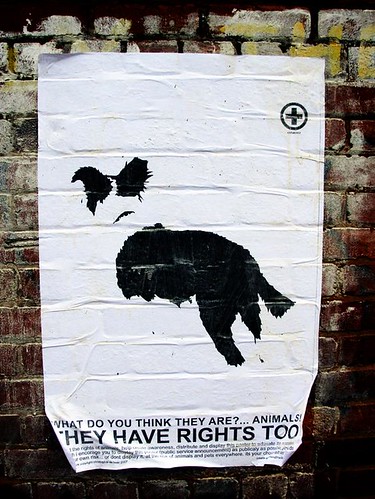
This is a poster campaign I'm doing as part of my Btech (4th year/degree show) in Graphic Design, specializing in Visual Activism and the role of graphic design in the communication of Public Service Announcements and constructive social commentaries. Uploaded at Flicker.
This one is stuck up on Botanic Gardens Rd. Durban, South Africa.
Thursday, August 16, 2007
Sagmeister on Happiness


I was browsing the TED site the other day, looking for interesting talks by "famous" people on design, that related to my 4th year work, to include in my academic report. And I came across a talk by Stefan Sagmeister on Happiness, very cool, if a bit sentimental (but I suppose thats happiness). Anyway heres the link to the talk( Yes, design can make you happy ), its worth a look :)
Friday, August 3, 2007
Similar Diversity, Information Design and Art

"Similar Diversity is an information graphic which opens up a new perspective at the topics religion and faith by visualizing the Holy Books of five world religions. Communalities and differences of Christianity, Islam, Hinduism, Buddhism and Judaism are shown up in this datavisualization." similardiversityWhen I see projects like this, it makes me wish my Graphic Design course had gon into more depth with regard Information Design. Theres are SO many brilliant ways to express simple information, and this is a prime example.
"The visual's basis is an objective text analysis of the Holy Scriptures, and works without any interpretations from the creators' side. Despite - or even because of this abstraction, the artworks are not only working on an informal but also on an emotional level. The viewers should be inspired to think about own prejudices and current religious conflicts."In Similar Diversity, all characters are aligned alphabetically on the x-axis. their name & arc size is calculated from their total word count in all scriptures. The colored arc segments show the frequency of the word or the character in the particular Holy Books. Bar charts below the names break down the activities of the characters in detail. The arcs connecting the names symbolize similarities of the activities assigned to a character pair.
Realised with Processing and VVVV.
Similar Diversity was exhibited at the Hangar-7, Salzburg: Is it possible to touch someone's heart with design? by Multimediaart and Stefan Sagmeister. via infosthetics.
Tuesday, July 24, 2007
Help Yourself Posters

Copy: "help yourself"
Very cool poster campaign by Leo Burnette (Sao Paulo), for CVV Suicide Prevention Center, Brasil. via DesignBOOM
Wednesday, July 18, 2007
Roadsworth Tour de France

"The grey area between graffiti and vandalism is more than theoretical for Roadsworth: his controversial street images have turned pavements in politics in the city of Montreal and rekindled debate about the nature of public art." Lost O
Peter Gibson, the man behind the Roadsworth graffiti identity, began taking to the streets of Montreal in late 2001, spray-painting cyclist symbols on the roads to protest the lack of bike lanes and paths in the city. Gradually his street images have developed into increasingly symbolic displays of civic and environmental critique.
"pedestrian crossings on the Plateau Mont-Royal turned giant footprints; orange stencils of barbed wire lined crosswalks; heart monitor-like spikes and valleys punctuated centerlines on roadways." Lost O
His most recent being a flock of birds road installation on the UK leg of the Tour de France as seen above. Noticed first at Wooster Collective.
Thursday, May 10, 2007
Face 2 Face project

The Face2Face project is a collaborative project with the authors aiming to create awareness and social comment about the issues between Israel and Palestine.
"The Face2Face project is to make portraits of Palestinians and Israelis doing the same job and to post them face to face, in huge formats, in unavoidable places, on the Israeli and the Palestinian sides. In a very sensitive context, we need to be clear. We are in favor of a solution for which two countries, Israel and Palestine would live peacefully within safe and internationally recognized borders. All the bilateral peace projects (Clinton/Taba, Ayalon/Nussibeh, Geneva Accords) are converging in the same direction. We can be optimistic. We hope that this project will contribute to a better understanding between Israelis and Palestinians." via Face2Face.com
Subscribe to:
Posts (Atom)